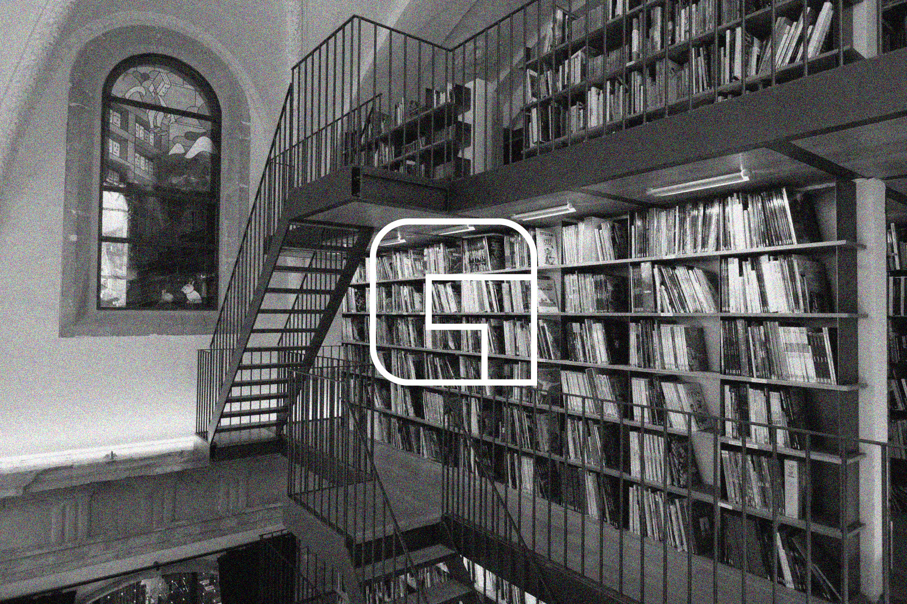
Glénat — Conception logo & refonte indentité visuelle
L’idée globale est de se réapproprier un style graphique existant qui a marqué l’histoire de la bande-dessinée, l’activité principale de glénat. La simplicité de la « ligne claire » facilite le développement d’une identité visuelle efficace et fonctionnelle. Cette toute nouvelle identité visuelle est également porteuse d’histoire et met en avant la longévité de Glénat qui existe depuis plus de 50 ans.
Pour concevoir ce logo j’ai donc repris les caractéristiques de ce style qui sont principalement des contours noirs de même épaisseur et des applats de couleurs. Ces caractéristiques sont liées aux contraintes posées autrefois par les techniques d’impression des périodiques enfantins. La méthode était similaire à celle appliquée pour colorer les dessins des vitraux, des limitations techniques imposant la séparation de chaque couleur.
Pour concevoir ce logo j’ai donc repris les caractéristiques de ce style qui sont principalement des contours noirs de même épaisseur et des applats de couleurs. Ces caractéristiques sont liées aux contraintes posées autrefois par les techniques d’impression des périodiques enfantins. La méthode était similaire à celle appliquée pour colorer les dessins des vitraux, des limitations techniques imposant la séparation de chaque couleur.
The overall idea is to reclaim a graphic style that has marked the history of comic books — the main focus of Glénat. The simplicity of the “ligne claire” (clear line) style makes it easy to develop a visual identity that is both effective and functional. This brand-new visual identity also carries historical significance and highlights Glénat’s longevity, with the company having existed for over 50 years.
To design this logo, I drew on the key features of this style, which are primarily black outlines of uniform thickness and flat areas of color. These characteristics are linked to the constraints once imposed by printing techniques used in children’s periodicals. The method was similar to the one used to color stained-glass drawings, where technical limitations required each color to be clearly separated.
To design this logo, I drew on the key features of this style, which are primarily black outlines of uniform thickness and flat areas of color. These characteristics are linked to the constraints once imposed by printing techniques used in children’s periodicals. The method was similar to the one used to color stained-glass drawings, where technical limitations required each color to be clearly separated.


Wireframe

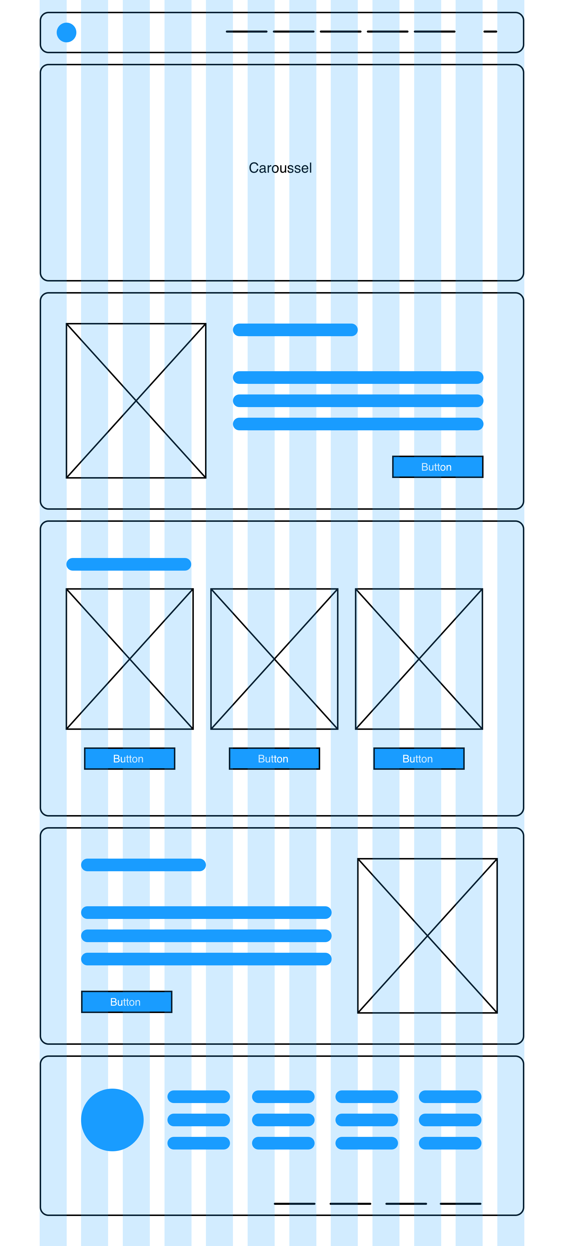
Website — Home
